Designing a logo is a lot harder than it sounds. That, or perhaps I simply do not possess the correct skill set and talent to make pulling off a logo look, feel, or seem easy. I’m close to sending the PCB design for the NIM-1 off to OSH Park for prototyping, and want to include a Venturii logo in the silk screen (and probably copper) layers. The only problem: I don’t have a logo for Venturii.
When Mark and I were forming Metal Minds, we labored over choosing the name for weeks. The brainstorm process was intense, at one point we got a white board and wrote down every word we could think of that had anything to do with things that interested us or possible directions our not-yet-formed company might take. Like a big game of Scrabble, we then tried arranging some of those words together to “try them on.” Some flowed better than others, so once we had a short list we tried answering a phone with each name. We tried writing the name down on paper, looked up domain names and researched existing companies with the same or similar names. When we finally arrived at the Metal Minds name, and after it had cleared all the prerequisite hoops and paperwork, we then decided it needed it’s own distinction. We began looking at typefaces or fonts, and tried writing the name with various combinations of capitals, lowercase and spacing. Seriously, you wouldn’t believe the amount of time we took in deriving the right look of that name. Don’t even get me started on the colors…
When it came time to create a logo for Venturii, I started out doing what I used to do a lot: I doodled. Armed with pencil and paper, I just started to draw. I liked the idea of a stylized “V”. The very idea of a venturi in fluid dynamics is similarly shaped with the letter V, so it seemed like a good place to start. Integration. Multiple devices or data sources coming together at or into central location. Arrows. Lines. Circles. Squirrel. Flow. Connectivity. Interaction. Interface. Intercourse. Interject. Interesting.
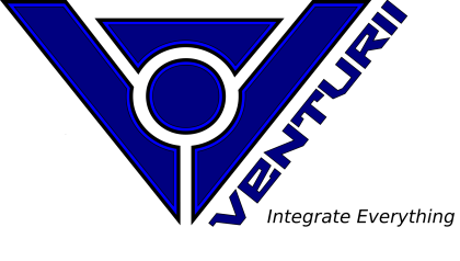
Long story shortened slightly, I ended up sketching something up that I rather liked, then tried to duplicate it in Inkscape, which was also the first time I’ve ever used that tool. The result was this:
So it pretty much looks like something you might have seen in an 80’s Sci-Fi movie. I’ve tried various color schemes and patterns, but I’m still not happy with it. Years ago I worked at a company who underwent a logo design process with professional help, and I learned a lot about the importance of several aspects of a logo I would not have considered. One was that it should be printable in both full color and in black and white without losing any important distinction. This logo meets that criteria, the V symbol is the same whether it is in blue or black. This makes it perfect for a PCB design. It could also be carved or cut easily out of wood, metal, acrylic, or any other material. I’m also picturing that logo mounted to a wall, backlit (the spaces between each component provide ample area for colored light to pass through, giving it a very nice glow. Perhaps it is the font that disagrees with me and I should consider another font. I think at this angle, the font certainly puts it several decades behind, which is ironic because it is the same font that was used for the Metal Minds stylized name, which I like. I guess geese and gander disagree in this case. Anyway, it will continue to be a work in progress. Feel free to add your comments or take it over to the forum at The Venturii Forum.

